
You’ve seen the captions.
“Photo dump ✌️”
“Things that made me smile this week 😌”
“IDK, just vibes 😎”
Carousels might’ve started as a casual place to toss vibey vacation pics, but at this rate, they’re one of Instagram’s most promising post formats.
Whether you’re a creator looking to attract brands to collaborate with or a small business trying to draw in local customers, carousels can help you accomplish your goals. And we’re about to show you how to put together a set of slides that hooks people in, racks up saves, triggers DMs, and most importantly, converts.
Instagram Carousels 101

Instagram carousels are a post format that lets you include up to 20 photos or videos in a single, swipeable post (like a mini slideshow). When users come across a carousel in their feed, they stop and swipe left to scroll through the post, one image or video at a time.
When it comes to curating a carousel, you can stick to static images, go all in on video clips, or mix the two in any combination you want. Want to walk someone through a tutorial with video clips and then show stills of the finished product? Doable. Prefer a step-by-step with text overlays on images? Also fair game.
Instead of picking one standout image and hoping it tells the whole story, carousels give you a chance to build something bigger; something with more narrative that’s more engaging and scroll-stopping.
Carousels consistently outperform other post formats
Single-image posts just don’t hit like they used to. Instagram’s algorithm has shifted (the only constant in life is change, etc), and post formats that keep users engaged longer — like carousels and Reels — are now the platform’s top performers.
Even Instagram’s CEO, Adam Mosseri, has repeatedly encouraged creators to experiment with carousels as a way to increase reach. And the numbers back him up: Carousels achieve 13% more reach than Reels, making them one of the few formats that can compete with flashy video edits and trending audio clips.
Carousels invite users to swipe and engage with multiple frames of content, which signals value and relevance to the algorithm. The more time someone spends on your post, the more Instagram boosts it. That’s why carousels don’t just perform well in the moment — they often resurface in a user’s feed later if they didn’t finish swiping through the first time. (Yep, your post gets a second chance to make a first impression.)
When it comes to engagement, carousels consistently outperform other formats. The average Instagram post has a .56% engagement rate, but carousel posts boast a higher rate (.69%). That difference might seem small, but over time, it translates into more visibility, saves, and opportunities to start conversations in the DMs.
How to Create a Swipe-Worthy Carousel

Slapping together some slides and hoping for the best might work sometimes, but the most successful carousels are thoughtfully put together. Here’s what to do.
Lead with your best image or video clip
The first slide of your carousel is your hook. It’s your opportunity to convince users to pause rather than keep scrolling. Plus, it’s the only image that will show up on your grid, so make sure it represents the whole post and fits in with your overall aesthetic.
As a general rule, treat the first slide like a cover image, but keep your goal in mind.
If you’re promoting a product, offer, or event, don’t give everything away upfront. Use the first slide to get users’ interest piqued and tease what’s coming.
Alternatively, if the point of your carousel is to teach the audience something (maybe you’re doing a tutorial, checklist, or tip series), your first slide should communicate what they’ll learn by swiping all the way through.
If you’re posting a photo recap or vibe-y brand moment, let your visuals do the heavy lifting. Use your best image (the one with the strongest composition, color contrast, and emotional impact) to capture attention and keep them interacting with your post for longer.
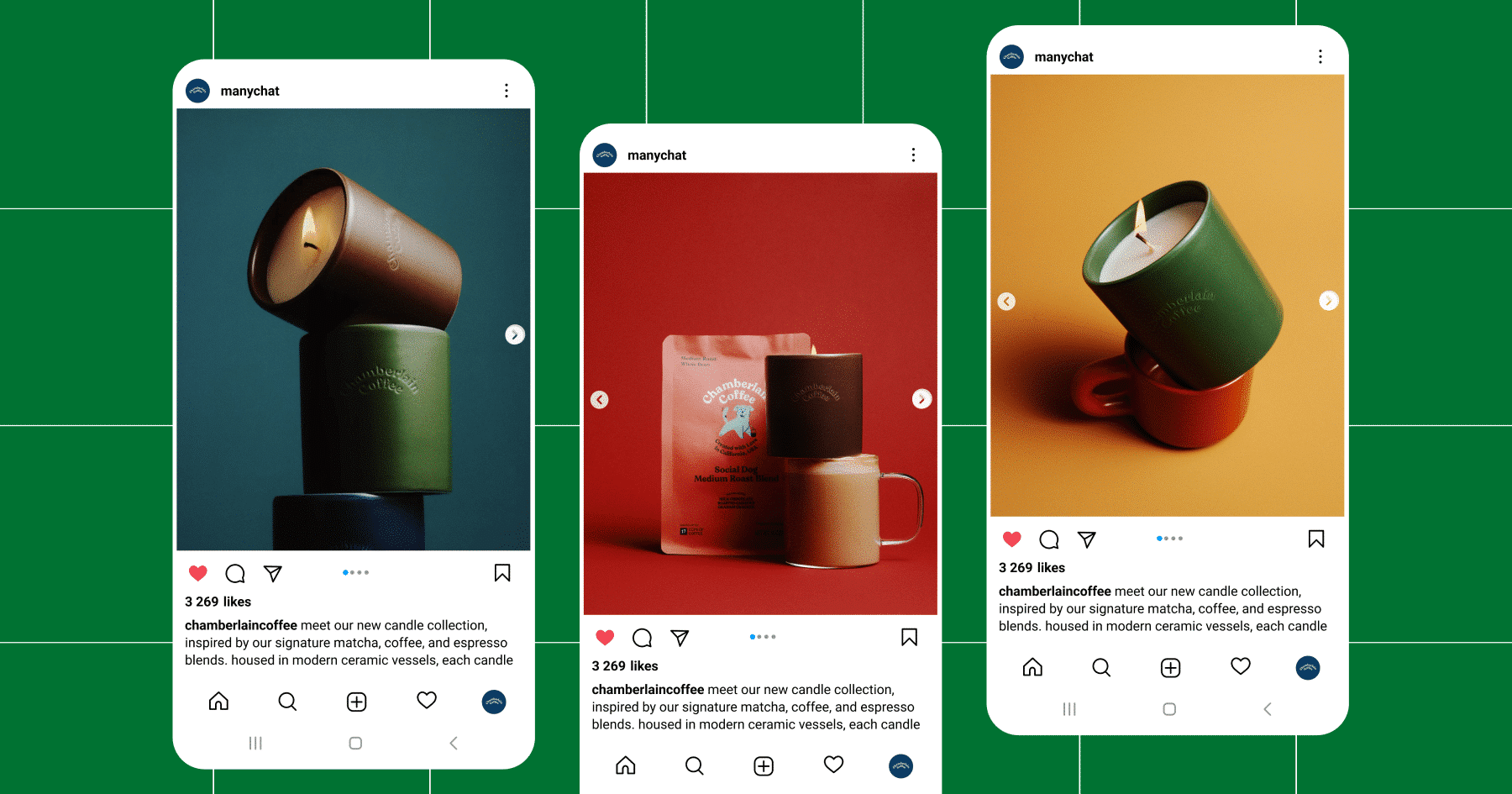
Chamberlain Coffee used a carousel post to announce their new candle collection, leading with a strong visual and following up with more focused shots of each scent:
Find the sweet spot with your slide lineup
You can post up to 20 slides in a single carousel, but that doesn’t mean you should use every slot every time.
Go long (15 to 20 slides) for:
- Step-by-step tutorials or walkthroughs
- Event or campaign recaps
- Deep dives into product features, services, or launches
Keep it short (five to 10 slides) for:
- UGC features
- Before/after transformations
- Product galleries
As a final tip here: Edit ruthlessly. If the content isn’t adding to your post’s visual or narrative aspects (more on that below), nix it.
Make sure there’s a visual and narrative flow
A good carousel feels intentional. Whether someone swipes through two slides or 20, the experience should be easy to follow and worth their attention. That comes down to two things: the design and the structure.
Visual consistency is key
When curating your carousel, use consistent fonts, filters, and colors across slides. Each frame should feel like a part of the same conversation, rather than 10 different posts stitched together.
Make sure your content is accessible. Use high-contrast, readable fonts and clear spacing. Add alt text, which is essential for screen readers and improves overall accessibility. Don’t overcrowd your slides and avoid placing text over busy backgrounds.
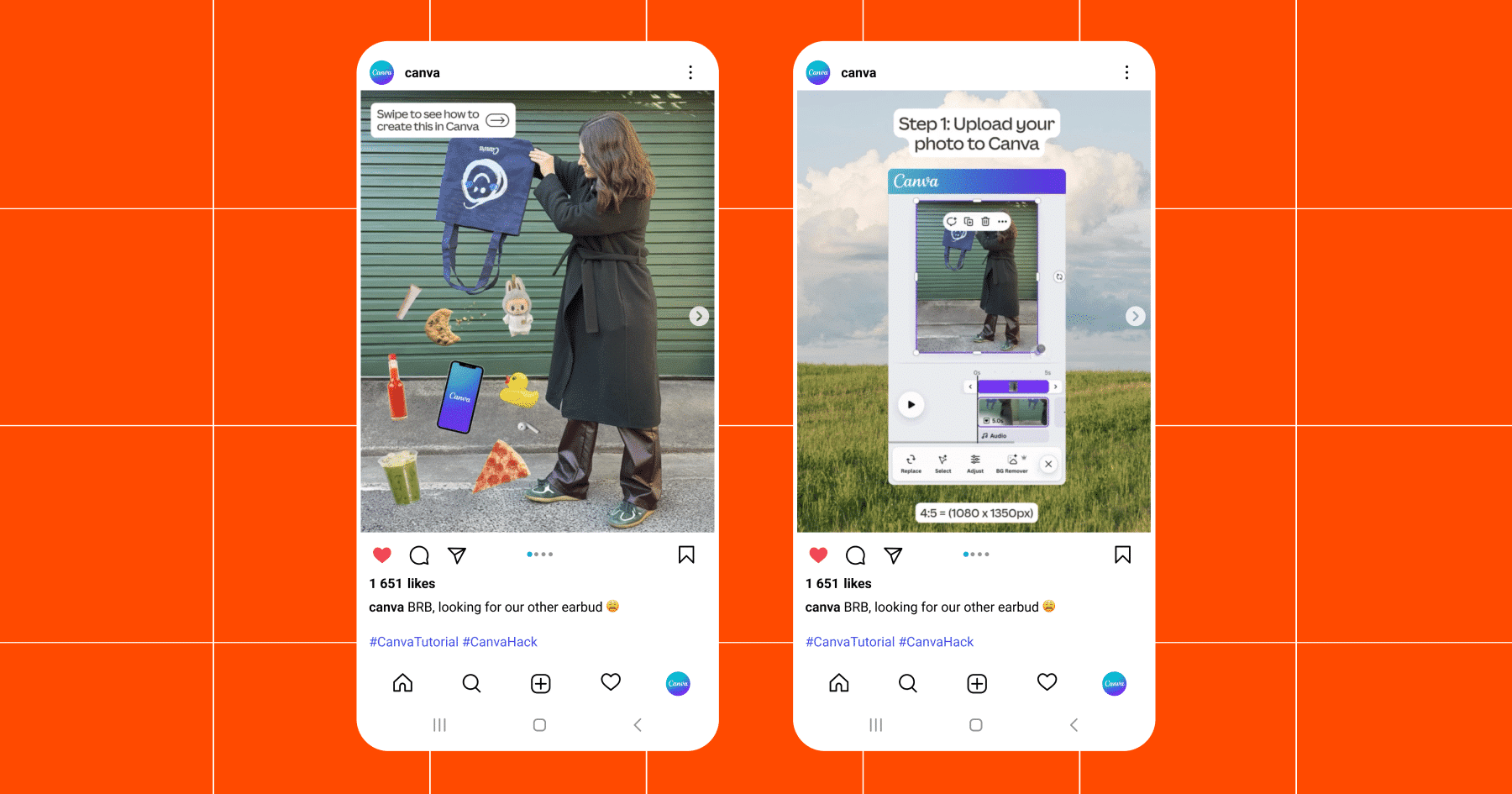
Optional: Create a visual thread that guides your viewer. This could be a recurring color block, a headline style, or a directional cue like the arrow in the post below.
A narrative or theme goes a long way
In addition to looking cohesive, your carousel should flow with intention. For that, use storytelling logic: Grab audience attention, build curiosity, deliver value, and drive action.
Whether you’re announcing a new product or educating your audience on a specific topic, this approach usually works.
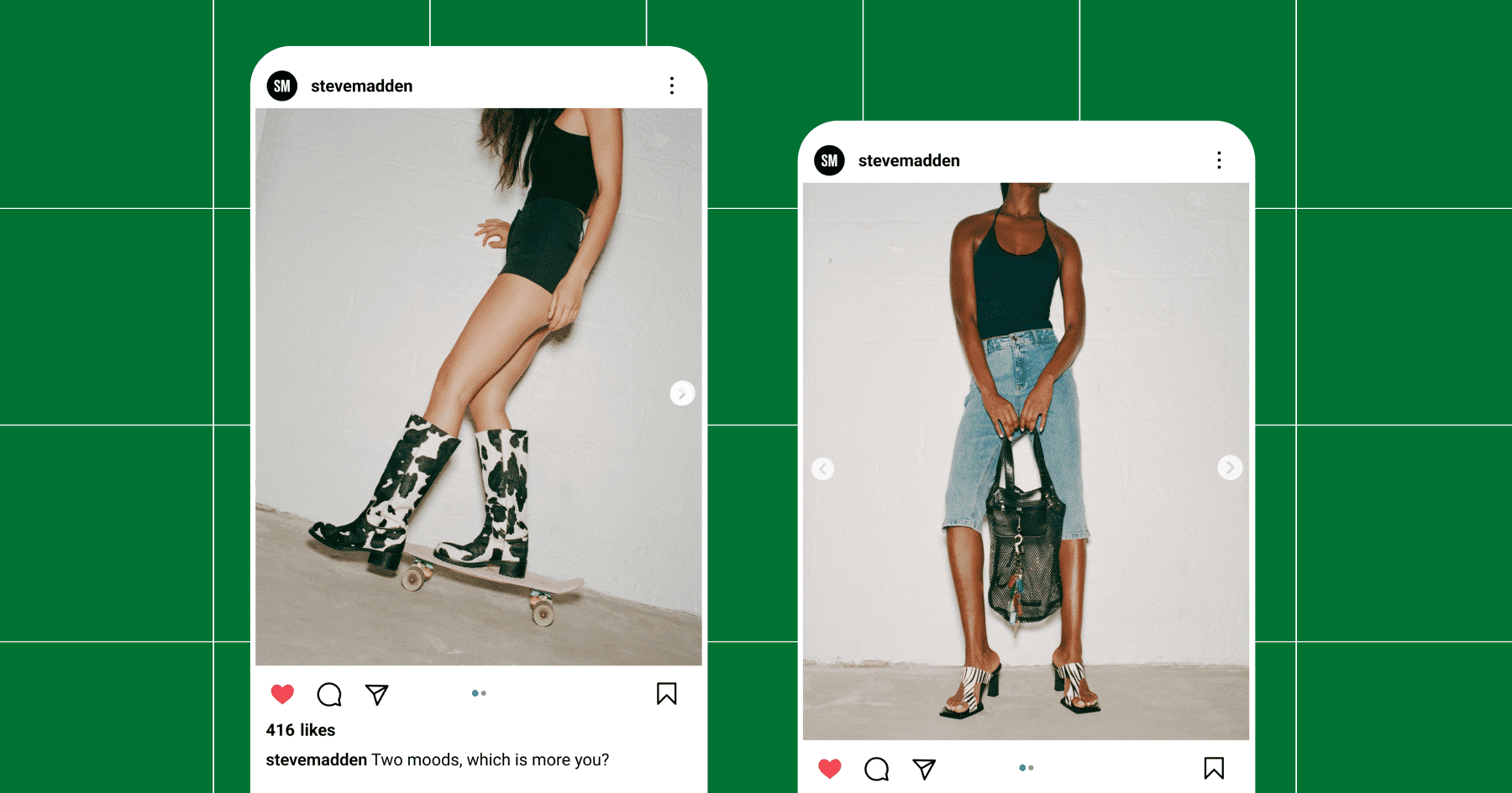
But here’s the thing: Not every carousel has to be a full-blown lead magnet or mini masterclass. Sometimes, the goal is simply to spark conversation and give your audience a reason to share or save your post. So, don’t overthink it — sometimes, two slides and a call to drop a comment is all you need (like in the example below).
Best Practices for Posting Your Carousel

So you’ve got a swipe-worthy set of slides ready to roll. Here’s how to make sure it gets the reach it deserves.
Carousel specs (keep it clean, keep it crisp)
- Recommended sizes: Stick to 1080×1350 (portrait) to take up more vertical space in the feed.
- Video limits: Each slide can be up to 15 seconds long, with a total runtime capped at two minutes. File size maxes out at 4GB, so keep things compressed and clean.
Features to take advantage of
- Add product tags and Shopping links. These turn engagement into action without needing to send users to your bio.
- Use pinned comments to highlight CTAs, FAQs, or conversation starters.
- If you’re teaming up with another account, use the collab tag to share the post to both profiles and double your reach.
Caption and hashtag FYIs
- Longer captions = stronger engagement. Aim for around 60 to 70 words (or 400 to 450 characters). That’s the sweet spot between “I’m listening 👀” and “I ain’t reading all that. I’m happy for you, though, or sorry that happened.”
- Use clear CTAs in the caption and carousel.
- Hashtags still matter, but don’t overdo it. Mix broad tags with niche, high-intent ones — and don’t rely on them to carry your post.
Bonus: Comment-to-DM Automation

A great carousel earns swipes. A smart one starts conversations.
With Manychat, you can turn a user’s comment into a personalized conversation in their inbox. And carousel posts are the perfect place to use it.
Here’s how it works:
You set up an automation inside Manychat’s Flow Builder that triggers when someone comments a specific word or emoji on your post. When they do, they’ll get a DM from your account, and you can guide them through whatever next steps make sense, like:
- Sending a freebie or lead magnet
- Collecting their email address
- Linking to a product or blog post
- Recommending a service or quiz
Applying this automation to carousel posts is simple. Just add your CTA to the caption and/or on the final slide of your carousel (Mindvalley offers a great example of how to do this in the post below). And because carousels often spark more saves and shares, your automation has more chances to catch engagement — even after the post’s initial run in the feed.

Carousels Deserve a Place in Your Instagram Strategy

Carousel posts outperform single-image posts with:
- Roughly 3x the engagement
- 1.4x the reach
- And double the comments!
The takeaway is clear: Carousels are still one of the best ways to reach and engage with your intended audience on Instagram. With the recently expanded 20-slide limit and features like comment-triggered DMs, you now have more opportunities than ever to create content that connects.
Next, sign up for Manychat and start creating those flows for free! Create a Manychat account.
Or, pick up some tips for boosting engagement on Instagram:
✋ Frequently Asked Questions (FAQs)
1. I made a great carousel. Why isn’t it driving DMs or sales?
Engagement isn’t the same as conversion. Swipes, saves, and likes are great, but if you’re not inviting action (like “comment 🔥 for a promo code”), you’re leaving value on the table. So, if you want your carousel to inspire action, give users something to do next.
2. Can a carousel replace a landing page or lead form?
Sure. When paired with Manychat, a carousel and comment CTA can do the work of a full funnel — educate, attract, qualify, and convert — all inside the Instagram app.
3. What kind of carousel works best with comment-to-DM automation?
Educational or list-style carousels (like tutorials, checklists, or tip roundups) perform best because they generate a natural payoff. “Want more? Comment below.” But even vibe-y posts can work, as long as your final slide or caption gives clear direction.
4. Can I use the same DM automation across multiple carousel posts?
Yes. You can reuse DM automation flows across posts with different angles. Just make sure to change the Keyword (for example, comment “FREE” vs. comment “GIFT”) if you want to track where leads came from.
5. What’s the best way to test if my carousel + DM combo works?
Is the call-to-action clear (comment X for Y)? Is the comment Keyword working and triggering the DM? Are people completing the flow (e.g., clicking your link, giving an email address)? If not, tweak your language or reduce friction.
Short, curiosity-driven CTAs often work better than generic ones like “Sign up now!”