Instagram Grid Layouts We Love (And How to Make Your Grid Bingeable)

Remember that time when everyone was adding white borders to their Instagram posts? Or using the same filter for every photo? How about when people were archiving basically everything on their page? (“Grid Zero” as they call it.)
When it comes to Instagram grid aesthetics, there have been all kinds of trends over the last decade. Well, I’m happy to report that having a perfectly curated grid isn’t as important as it used to be. People want authenticity more than anything else these days, so as long as you’re keeping it real, you can skip the branded fonts and strict color palettes.
That said, your grid does have a job to do: communicate who you are and convince a scroller to keep on scrollin’. If you want to learn how to do that and see some examples of Instagram grid layouts from brands and creators that work, keep reading.
How the Instagram Grid Works Today
No bombshells here; the Instagram grid still works like it always has (for the most part). When you post something — either a picture, carousel, or Reel — it appears on your profile grid. Actually, Instagram Stories are the only content that won’t appear in your grid. Those get featured on your profile picture, in the Story bar, and/or in the Highlights section.
On mobile, the Instagram grid has three columns across. On a desktop, it can have four to six columns across.
In 2025, Instagram updated the size of post previews on the grid from a 1:1 square ratio to a 3:4 vertical, portrait-oriented format (1080×1350 pixels). The idea behind the change was to align previews with the vertical format of reels. It’s something to keep in mind if you design a lot of reel covers.
As of 2026, the Instagram profile grid includes four tabs:
- Main tab: All of your Instagram content in one place
- Reels tab: Only your reels
- Reposts tab: Content you’ve reposted from other accounts
- Tagged tab: Posts where other users have tagged you
FYI: The reposts tab will only show up if you repost content.
How to remove posts from your grid
If there’s a post that you don’t want to show up on your grid, there are a few things you can do to hide it without deleting it.
- For individual posts: Open the photo or video, tap the three dots, and select Archive.
- For reels: Archive the reel if you don’t want it to appear at all, or select Remove from main grid to make it visible only in the reels tab.
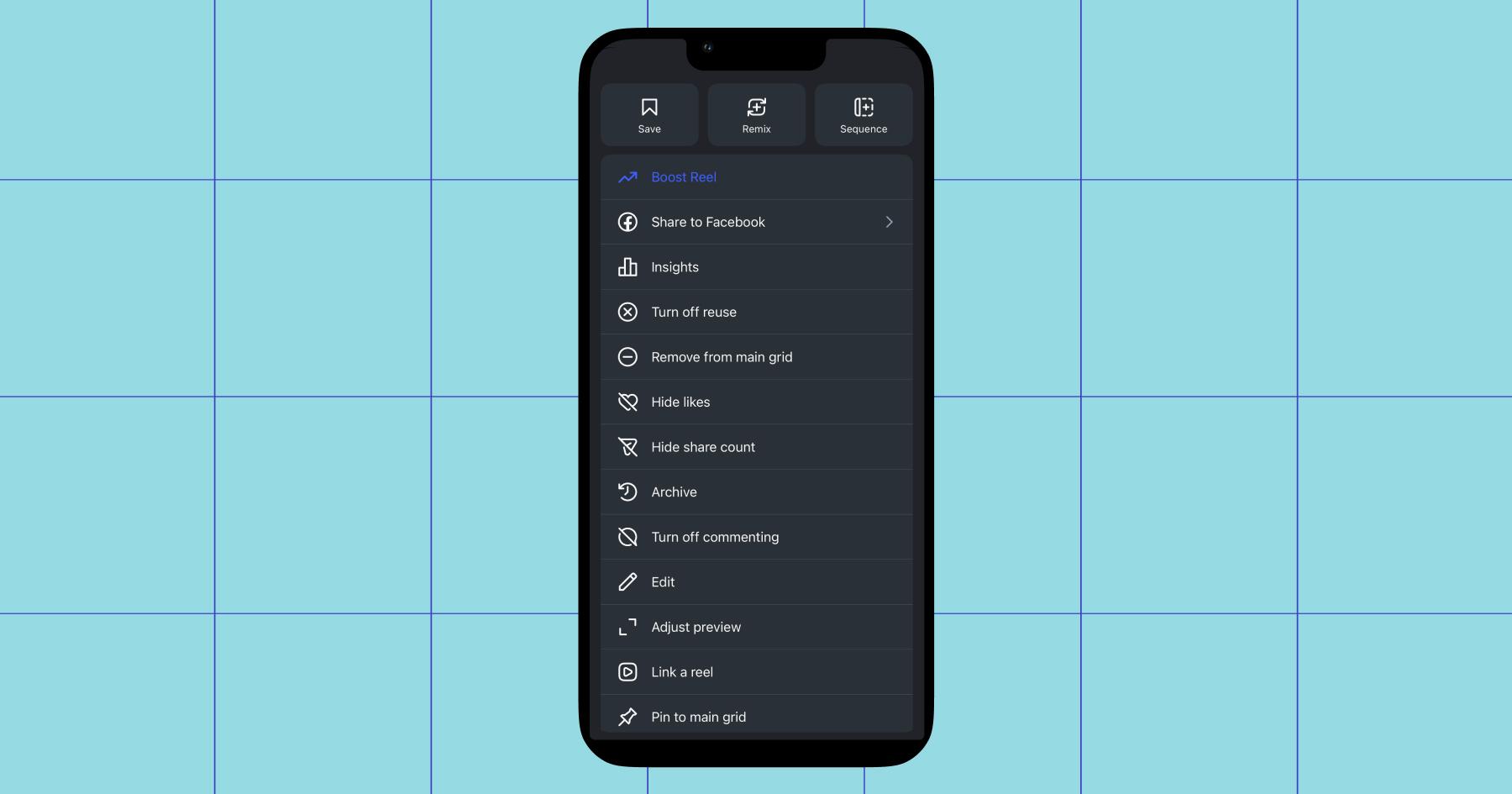
If you’d like to find your hidden content, go to your profile, tap the three horizontal lines (menu), and select Archive. You can also unhide content here.
So, does grid aesthetics matter?
Yes and no.
You don’t need an aesthetically cohesive grid to find success on Instagram today, but you do need eye-catching images and thumbnails to make people want to scroll through your content. And in highly visual niches (graphic design, photography, videography, etc.), a clear visual theme is still very important.
“Here’s how I think about it: If someone visits my page for the first time after seeing one of my posts, how easy is it to find similar posts on my page? Do the cover images properly illustrate what the posts are about? Do the posts look engaging and make me want to tap them?” says Reddit user -soof in r/InstagramMarketing.
“If [your grid] looks too organized or planned out, it comes off as an advertisement. If it’s too chaotic, it’s difficult to find content on your page.”
Bingo. Your grid should feel like a natural collection of your content. But if you want to grow your following, you need to make sure that when people land on your profile, they want to stay there and explore for a while.
5 Instagram Grid Examples to Draw Inspiration From
Now for the gridspo: a curated list of creators and brands with grids worthy of learning from. We’ve organized these examples by niche so that it’s easy for you to find one to add to your Pinterest board (do people still use those?).
1. Lifestyle creators: Keep it personal, but purposeful
If you look at lifestyle creators like Janesha Moore, Sarah Gavilla, and Bailey Peyton, their grids are far from random. They all feature a mix of everyday moments, trend-inspired reels (storytime, opinions, product reviews, etc.), and value-offering content.
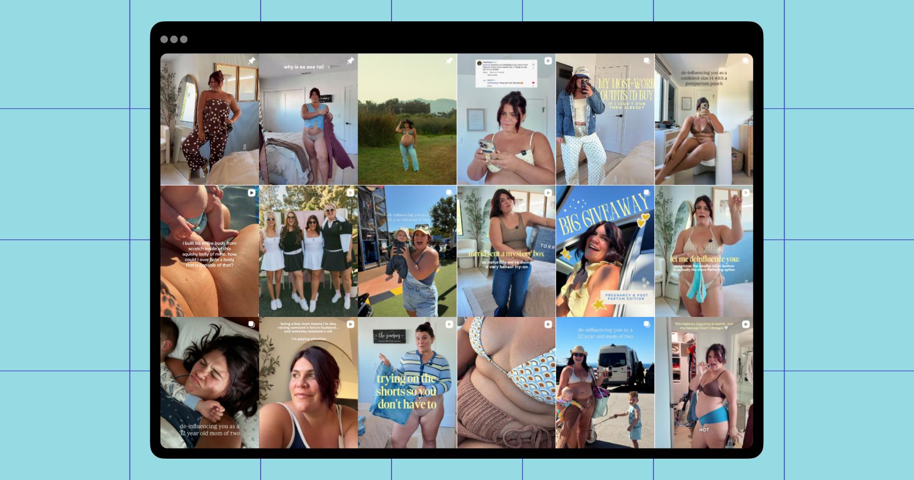
Let’s use Janesha’s grid as an example. Janesha’s posts are all centered on her and her lifestyle, but her grid makes it easy to see the formats and topics she typically shares.
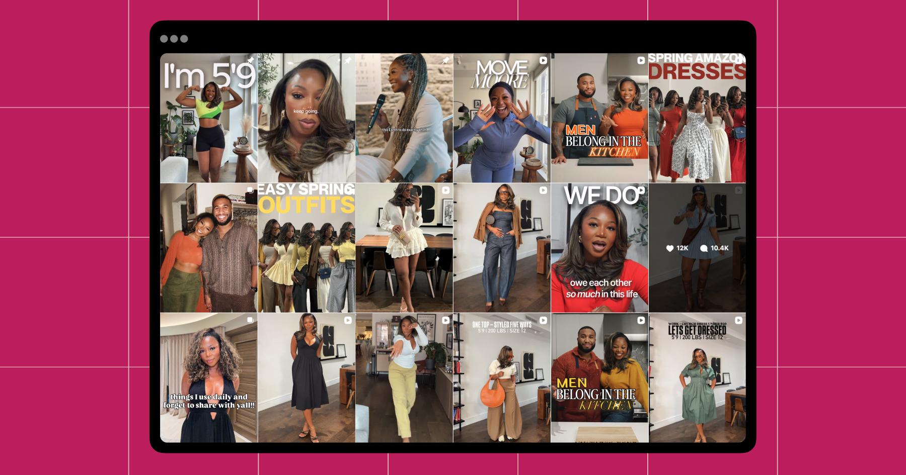
- Subniche: Most lifestyle creators have a subniche they create content around. For example, Janesha posts about her outfits, Sarah posts about ballet, and Bailey posts about being a mom. None of these women just post about these things; they all heavily incorporate their subniche into their grids.
If your grid feels random, consider defining your subniche — a topic you could write dozens of posts about. - Recurring visual theme: Janesha doesn’t have a strict aesthetic, but she is in every post preview, which helps the grid feel cohesive. She also uses bold text in all of her reel covers — more on that next.
If you’re a lifestyle creator, you don’t need to stick to a specific color palette or font. (Sorry, but the beige girl trend is dead.) Even so, there should be something tying your posts together, whether that’s you, your filming space, or a blue cardigan you wear in every single post. - Clear, engaging post previews: Both Bailey’s and Janesha’s reel covers use bold, easy-to-read text (e.g., “let me deinfluence you,” “things I use daily”), to make it clear what they’re about and encourage people to watch.
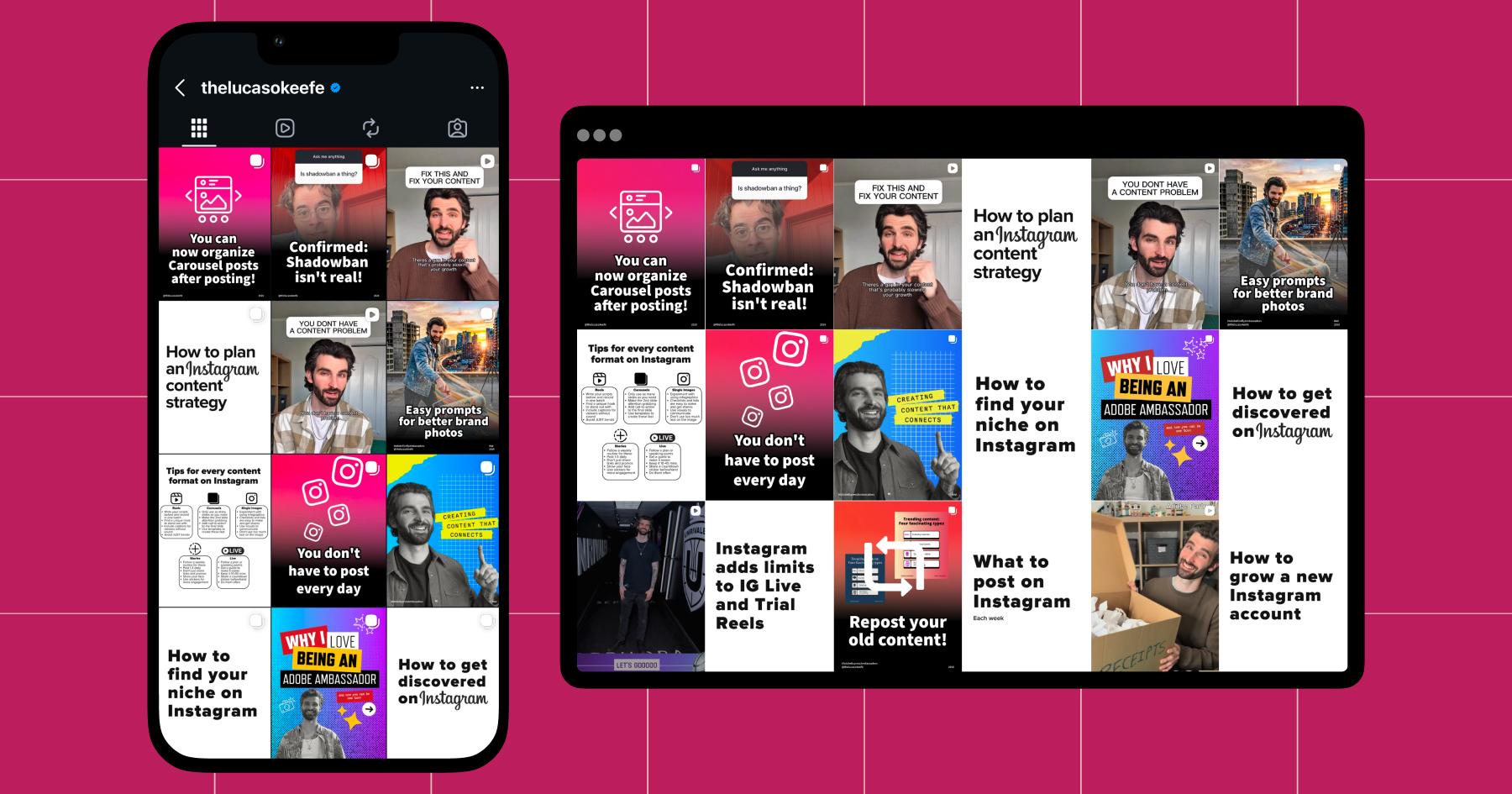
2. Educational creators: Prioritize the payoff
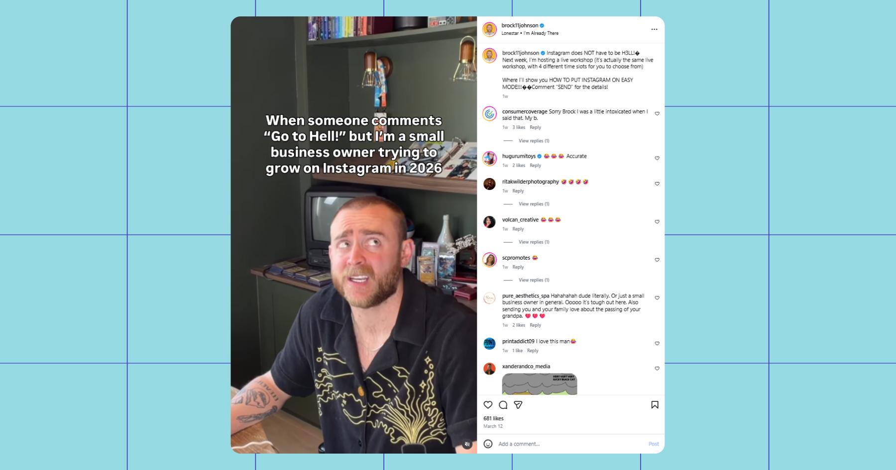
Educational creators like Vivian Tu, Lucas O’Keefe (whose grid is actually the first featured in this article), and Brock Johnson prioritize the value and usefulness of their content over its aesthetic.
Most creators in this niche post a mix of educational content, credibility-building moments (press features, speaking events, etc.), and the occasional lifestyle post. And they all make sure you know when you look at their grid that if you follow them, you’re going to have access to their expertise.
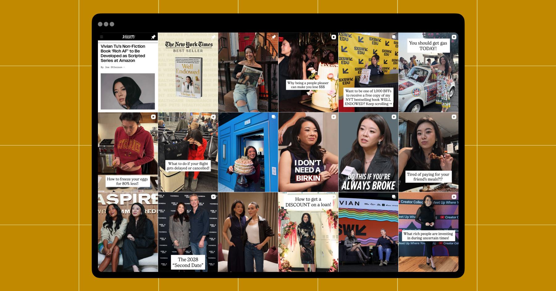
Vivian’s grid provides a great example of how to create educational but bingeable content. It checks all the boxes:
- Clear, benefit-driven topics: Posts like “How to freeze your eggs for 80% less,” “What to do if your flight gets delayed or cancelled,” or “Do this if you’re always broke” make it immediately obvious what problem(s) her content solves.
- Text-heavy post previews: Once again, we’re seeing the importance of having strong reel covers. Vivian’s previews function a lot like headlines, i.e., “Tired of paying for your friends’ meals?!?”
If you’re in this niche, take heed: The importance of a bold hook on your reel cover (and in the reel itself) can not be understated. - Relatable scenarios: Instead of abstract financial advice, Vivian’s content is framed around situations people actually experience (travel mishaps, big purchases, splitting bills). Brock Johnson’s content is the same: helpful and relatable.
- Credibility baked in: Media features, events, and her book show up throughout her grid, reinforcing her authority.
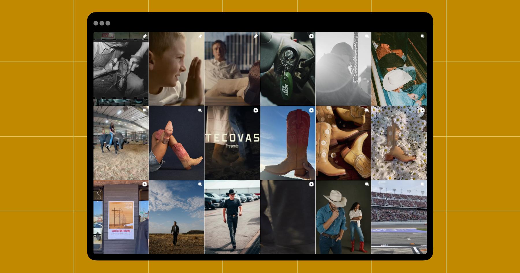
3. Visual artists: Let your style speak for itself
If you’re a photographer, designer, videographer, or artist, you’re probably using your account like a portfolio to drive potential work. As a result, your grid should be more cohesive and aesthetically pleasing than the average account.
Wedding photographer Colette Elyse (@coletteelysephotography) has organized her grid to feature a mix of candids, portraits, and detail shots (invitations, florals, and tablescapes), with the occasional behind-the-scenes or personal image.
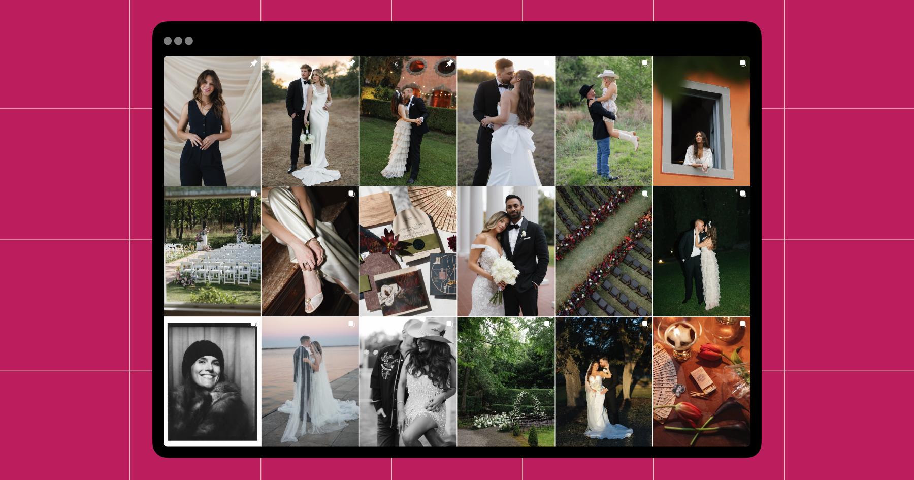
Let’s talk about what specifically is working for Colette:
- Defined subniche: It’s very clear she’s a wedding photographer, which helps her attract the right audience (couples planning weddings). Whatever kind of art you create — editorial photography, brand design, digital illustrations, oil paintings, etc. — your grid should quickly answer what someone would hire or follow you for.
- Consistent visual style: From lighting to composition to color grading, Colette’s photos have a cohesive look. She also incorporates film photography, which adds to the distinct feel of her work.
For other artists, this could look like a consistent color palette, brush style, editing style, or subject matter. You don’t need every post to match perfectly, but over time, your work should feel recognizable at a glance. - Balance of shots: Colette’s grid includes everything from full-ceremony setups to close-ups of shoes, invitations, and decor, capturing both the big and small moments. Iulia’s is mostly her work, but she features rough oil sketches alongside short animated films.
No matter your medium, post a variety of your work. For instance, a painter could post finished pieces, close-up texture shots, and works in progress.
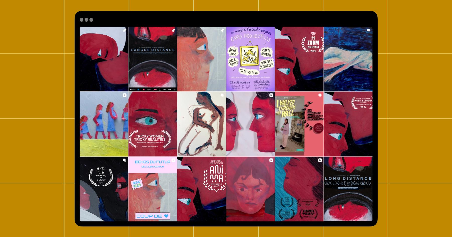
Essentially, if you’re a visual artist, everything that goes on your grid should reinforce your style and the kind of work you want more of. (Above is an example from French animation artist Iulia Voitova.)
4. Meme accounts: Whatever inspires a share
Meme accounts like @memezar, @betches, and @fuckjerry don’t worry about having a curated page — they post whatever’s trending, funny, or relevant, so there’s really no way to stick to one aesthetic.
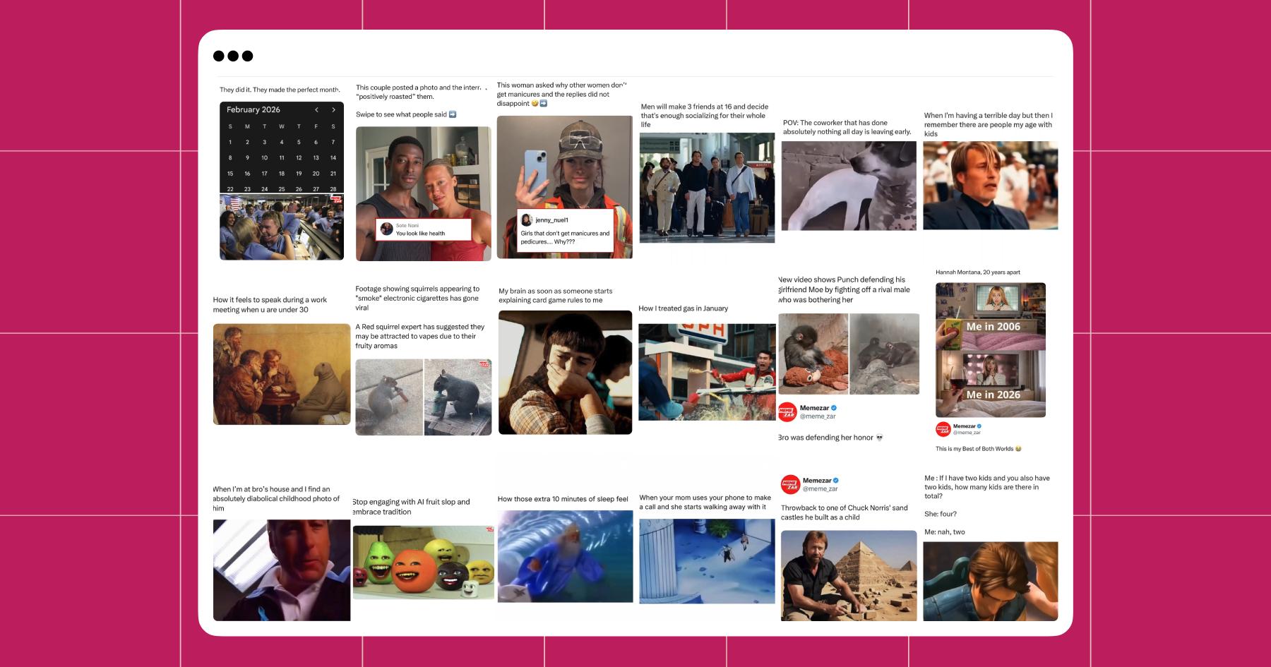
Memezar’s grid (above) is designed to get clicks, shares, and reactions above all else. This is the gold standard for meme pages.
- Relatable, scroll-stopping hooks: Your posts should start with a line of text that immediately drops the scroller into the joke or scenario (e.g., “POV: …” or “When you…”).
- Consistent voice: Visuals are all over the place for Memezar, but the voice is consistent — the word ‘bro’ gets used a lot. If you’re running a meme page, make sure there’s a recognizable voice behind the lols, whether you use sarcasm, nostalgia, or hyper-specific references to bring it to life.
- High volume and timeliness: Meme accounts post frequently — sometimes more than once a day. But that’s somewhat necessary in this niche, because we all know that the timelier the meme, the funnier it is (and crazy shit is happening all the time).
If you’re running a meme or media account, don’t obsess over how your grid looks. Instead, focus on writing better hooks and captions, as those are what will get people to engage with or share your content.
5. Brands: Sell the vibe, sell the product
It’s tough being a brand on social. Most people aren’t opening Instagram to be sold to; they’re there to scroll for entertainment.
That means that if you’re running a brand account, you need to go beyond just posting what you sell. The companies that are crushing it aren’t posting product shots. They’re doing fun campaigns, collaborating with creators, and sharing moments that make you want to be a part of their world. (Or if they’re Brita, they’ve created a dating show featuring an animated shark.)
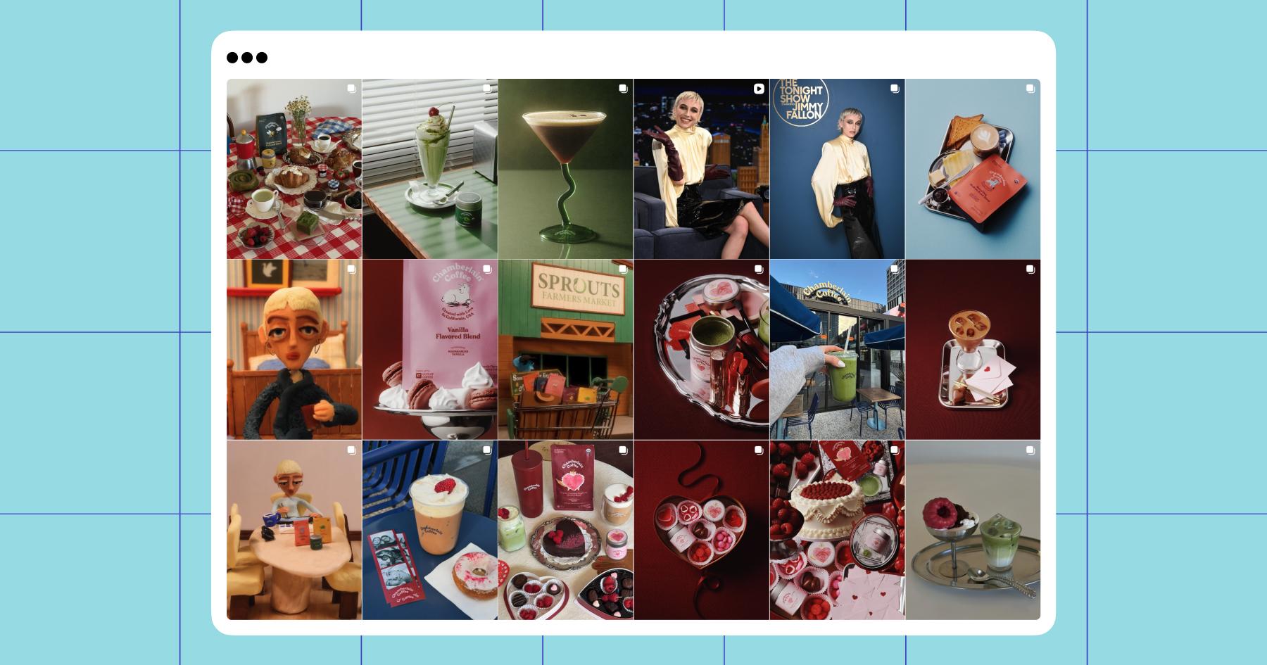
Let’s take a look at Chamberlain Coffee. You’ll notice the product is present all over the grid, but the aesthetic feels more like a moodboard than a catalog.
- Product-forward content: Yes, the coffee is front and center for Chamberlain Coffee, but it’s portrayed in creative ways (bold colors, playful props, seasonal setups). There’s also a mix of polished studio shots, UGC, and campaign content to keep the grid from feeling stale.
Tecovas is another great example — boots are on the grid, but there’s also a lot of what I like to call vibe content. And on that note… - Recognizable vibe: Colors and campaigns change, but the overall feeling and themes that come to mind when your brand comes up should stay consistent. For Chamberlain Coffee, the vibe is playful, quirky, and feminine. For Tecovas, it’s elevated Western. Both accounts are consistent with their themes, which helps make the brands memorable.
If you’re managing a brand account, think of it as a place to both sell and tell a story. There’s real value in building a world around your brand. People don’t follow brands for product updates — they follow them because something about their content reflects their identity, their taste, or simply makes them feel something.
Get Griddy With It

At the end of the day, the best Instagram grid layout for your account is the one that makes people want to scroll and tap into more of your content. And whether you’re building a personal brand, selling a product, or just trying to make someone laugh, your grid should reflect that right away.
So take what works (gets views and engagement), leave what flops, and don’t be afraid to experiment — you’re only ever a few posts away from a completely different grid.
Looking for more ways to level up your Instagram content?
- Need Instagram Story Ideas? We’ve Got ‘Em
- Let’s Get Reel: Videos are Instagram’s Most Important Content Format
- How to Create a Swipe-Worthy Instagram Carousel
Frequently asked questions
Short answer: good content. (Ideally, your content is interesting enough that someone who comes across it wants to follow you and see more.)
Long answer: CTAs and clear next steps. You can’t expect everyone who scrolls by one of your reels to become a follower, so it’s best to create distinct goals for each piece of content. If your goal is to get more followers, add a “follow me for more tips/bits/niche pet photos” line to the end of your reel. If you want to drive conversions, you can use Manychat, i.e., “DM me ‘skirt’ for the link” or “comment ‘HOLIDAYS’ to subscribe to my gift guide.” Alternatively, if you just want your posts to get more reach, you can go with a version of the “tag/share this with a friend who would like this” CTA.
Your grid’s job is to earn the click. Each piece of content within it needs to have its own goal, even if it’s just to get engagement.
– Prioritize clarity: Someone should know what the post is about immediately.
– Add bold, readable text. This is especially important for reel covers.
– Mention specific outcomes: “How I grew to 50K followers” beats “Social media tips.”
When someone lands on your grid, they’re scrolling through your content. The goal should be to make them want to tap on individual posts and consume more of your content. If your covers look cute but don’t inspire someone to tap, it’s time to change something.
Make your niche and typical content format(s) obvious at a glance. Create content around the same core topics and use consistent formats (e.g., talking head tips, carousels, before/afters).
If your grid feels random, it’s probably because you post about too many topics or don’t have recurring formats.


Originally published: Apr 1, 2026, Updated: Apr 1, 2026