Online stores and small business owners encounter many difficulties in digital marketing. One of the most common challenges they face is figuring out the most cost-efficient way to get people to convert, including on social media. It’s different for each business, making it impossible to rely solely on tactics that have worked for others.
The lone exception is the call-to-action (CTA) button, which is regarded as a fundamental part of all successful marketing strategies.
Whether they’re part of your Messenger marketing lead gen flows or your company website, persuasive call-to-action buttons are critical for improving conversions, increasing revenue, and selling more products.
Not sure where to start tweaking your call-to-action buttons to achieve your goals? Don’t sweat it—we’re here to help.
This guide will help you create stronger CTA text for your marketing copy, and provide high-converting call-to-action button examples to inspire your omnichannel campaigns.
What is a call-to-action button?
A call-to-action button is used in digital marketing assets to encourage customers to take a step towards conversion, or even convert. It’s the element of an email, text, landing page, ad, or Messenger window that a person would click to take a desired action.
CTA buttons vary in size, color, and shape depending on your conversion goal and style (more on this later), so don’t assume there’s a perfect one-size-fits-all solution for everyone.
Some examples of CTA buttons include:
- Newsletter sign-up buttons
- Add-to-cart buttons
- Messenger chat buttons
- Free trial sign-up buttons
- Learn more buttons on Facebook ads
You get the picture. Your CTA button has one goal: getting people to click and take that next step, whatever it may be, towards a conversion.
By crafting CTA buttons that attract attention and deliver compelling messaging, you’ll get customers to take actions that will keep them engaged. These actions will also help build ongoing meaningful interactions with them that will solidify your relationship.
The action you promote should facilitate the customer’s intent. If they’re browsing products in Messenger, they may be interested in buying something, whereas a shopper poking around your homepage may only be keen to learn more about your brand. A CTA is there to help them fulfill a particular task.
Because there’s no step-by-step formula to create the perfect CTA button, it’s essential to test different messaging, placements, and colors to understand what resonates with your audience.
Call-to-action button best practices
The first step towards creating an effective CTA button is identifying a shopper’s goal—the words you’d use for a newsletter sign-up are entirely different from the copy you’d write to encourage a shopper to join a VIP program.
Here are some tips to keep you on the right path when composing your CTA text.
Use concise CTA language and copy
Write short yet descriptive CTA text that motivates people to act like “Sign Up” or “Buy Now.” Tell people exactly what you want them to do using phrases that fit your brand voice. For example, if your brand personality is elegant and elite, you wouldn’t want to use a phrase like “Hit me with questions!”
Tell readers exactly what they’re getting into before they click the CTA button. Don’t entice them with powerful words and an appealing value proposition only to under deliver on your promise.
If you can’t condense your message enough to fit into an effective CTA button, you can use microcopy to provide context on a website. For mobile buttons (think Messenger or SMS), you can add context about the action you want readers to take in the message.
Be thoughtful about selecting a call-to-action button color
There have been a few studies around color and CTAs, but it’s hard to determine what the “best” colors will be for your buttons without testing. Aim to limit your button colors to one or two that will stand out from the rest of your website.
The fewer colors you use in call-to-action buttons, the cleaner your store will look. Plus, readers won’t be distracted from the rest of your copy by a rainbow of “Buy Now!” and “Sign Up!” buttons sprinkled throughout your site.
It’s hard to go wrong with your “highlight” colors that are already used elsewhere in your branding and to which your audience responds well.
Add a sense of urgency
Sometimes a CTA button gets a shopper excited right away. Maybe they’re just pumped to buy your product! In that case, they don’t need an extra push to click. Other times an action isn’t as compelling, and the shopper will consider whether or not to take that next step.
Adding urgency to your call-to-action button could lead to higher conversions because it feeds on people’s base urges to tamp down on anxiety. It limits their time to think, nudging them to follow their impulse to take action now, rather than later. An example of an urgent CTA button could be “Buy Now: Limited Stock Available.”
Use button graphics
There’s likely more than one emoji to match what you’re offering, so find one to add to a button where it’s relevant. This is more reader-friendly because it’s easier for people to process images and they inject a bit of personality into your brand.
“Based on past A/B tests we ran for Messenger bot CTAs, all my buttons have emojis because they add visual interest,” explains Angela Allan, Founder of Award-Winning Chat Marketing Agency Mads Collective. “It’s also a good option to replace words with emojis when you’re limited by character count.
“People don’t always read the entire message,” Angela adds, “so they will rely on the buttons as directional cues to guide them through a flow. If you can add an emoji to your button text, like a ✅ for a yes answer, or a ❌ for no answer, that will also help them move through it easier.”
Test CTA buttons
Different CTA text, placement, offers, visuals, etc., produce different results. Conduct A/B tests to experiment with variations of your CTA buttons and see which ones perform best. This can help you optimize your flows and website.
Best call-to-action button examples
Below are some of the best call-to-action examples to inspire your omnichannel marketing campaigns.
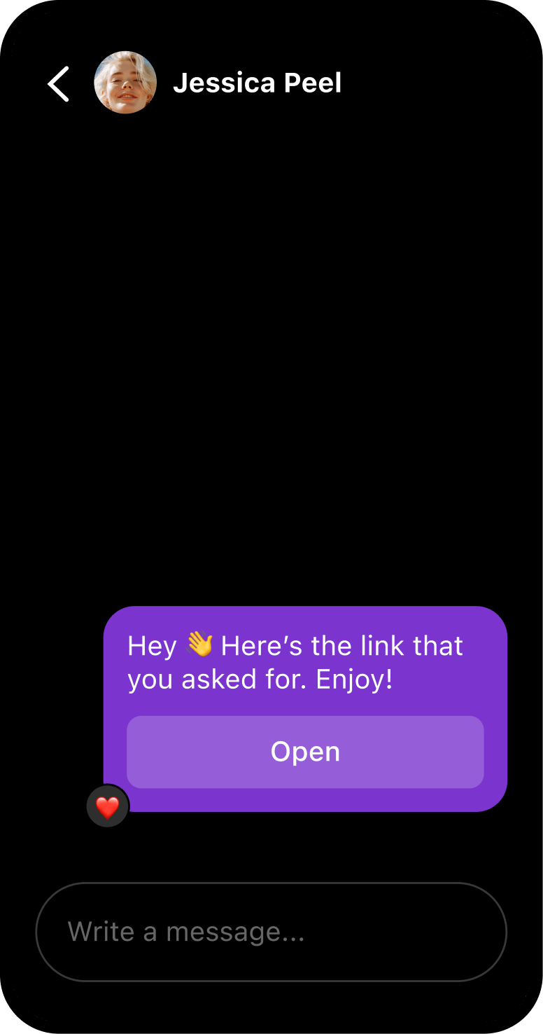
Local Mexican Restaurant
Another great call-to-action button example is from a local Mexican restaurant based out of Spokane, WA.
Rather than send interested customers to their website to redeem a promotion, the restaurant directs them into Facebook Messenger straight from the email message. While in Messenger, the customer can ask questions and further engage with the brand.
Think for a moment how people interact with your emails: They click, end up on your website, and then you might lose them unless you run retargeting ads or send cart abandonment messages. That’s a lot of wasted effort!
By sending potential customers to Messenger instead of your website, you can proactively engage them and improve your omnichannel marketing campaign results. Switching your CTA to Messenger is easy to set up and it’s a no-brainer way to increase your conversion rate.
Messenger
FitFam
FitFam is an online fitness dropshipping store that sells yoga equipment.
While some companies send cart abandonment messages with CTA’s like “Return to Cart” or “Review My Order,” FitFam sends a custom Messenger follow-up with a personalized coupon and “Check Out” CTA button that directs people back to their cart straight from the conversation.
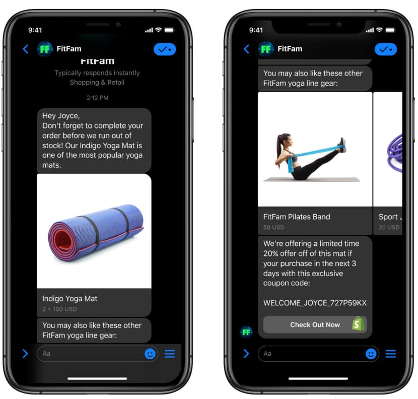
Using Messenger to send cart abandonment follow-ups are a fun and interactive way to present forgotten products and set your brand apart.
Angela Allan
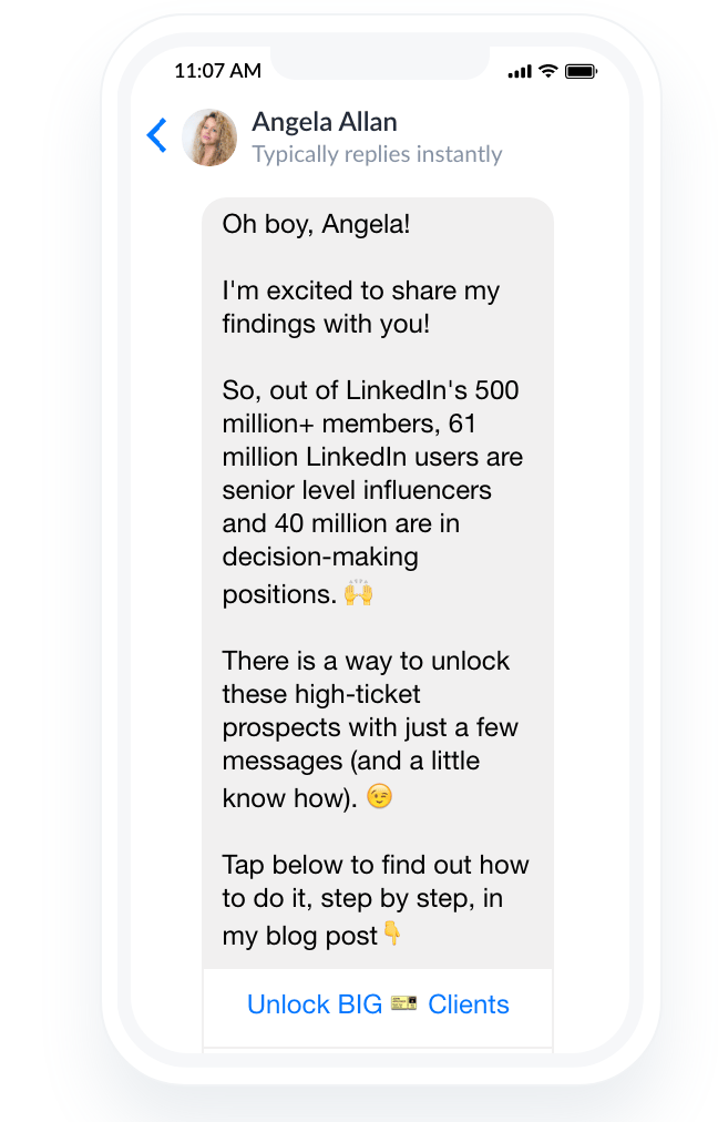
Angela Allan has some great examples of using emojis in her call-to-action messaging. In her Messenger bot CTA, she includes a hand pointing down as part of the message “Tap below…” which guides users toward a clickable button stating “Unlock BIG Client” that will lead them to her blog post on how to snag a big account.
The entire message is enticing and designed to excite readers who want to improve their LinkedIn marketing skills. She even includes a ticket emoji in her CTA to quickly grab the reader’s attention with a visual and motivate them to click.
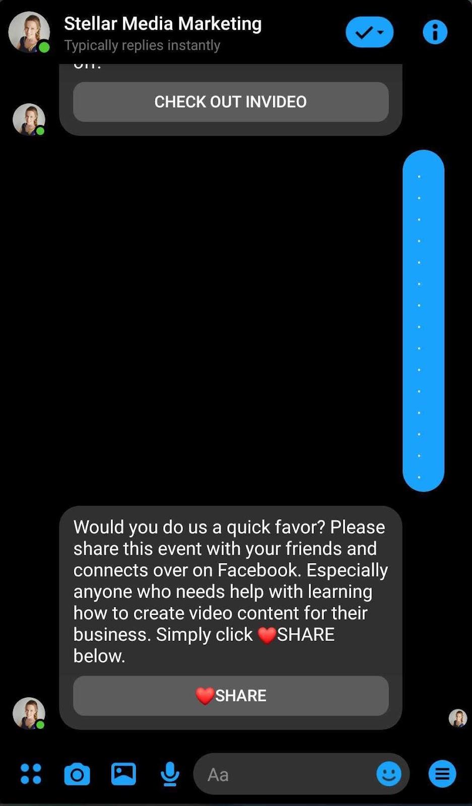
JUMP Consulting
JUMP Consulting is a pet coaching business run by Bella Vasta. To motivate her audience to share an upcoming Facebook Live Event, she used a red heart emoji and “SHARE” Messenger button at the end of a sign-up flow. This successful CTA button helped JUMP Consulting’s Facebook Live event realize a 27.4x increase in shares and a distribution boost of 229.5x.
Website
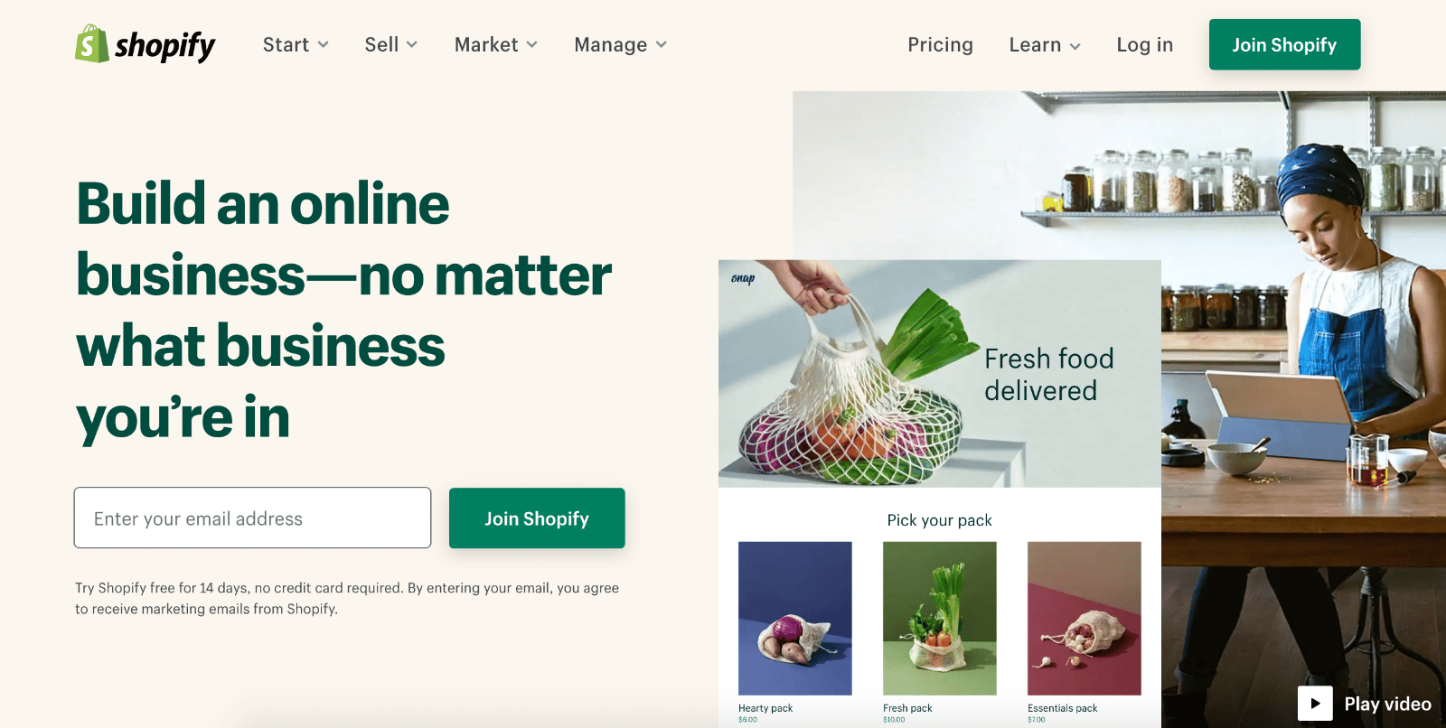
Shopify
A lot of companies use a free trial as a CTA to encourage sign-ups on their website. But Shopify does it a bit differently—instead of the standard “Get Started” CTA copy, they use “Join Shopify.”
Asking people to “join” rather than “get started” is a simple tactic that makes Shopify feel more like a community-based brand than a faceless corporation. All the critical information (try Shopify free for 14 days, no credit card required, etc.) lives underneath the CTA.
The brand knows free stuff and community are attractive to new entrepreneurs with no budget, creating an appealing proposition to sign up.
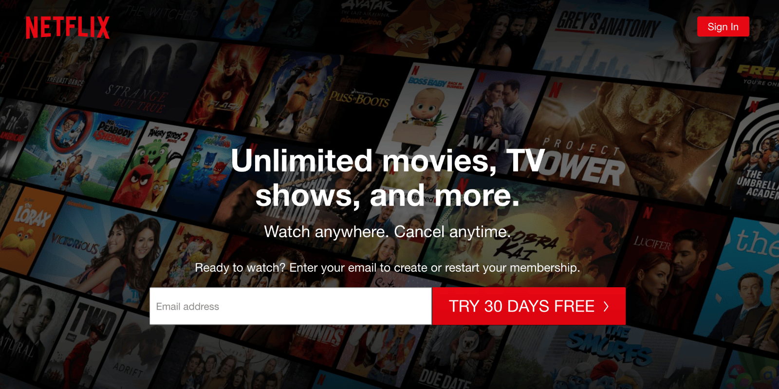
Netflix
Netflix’s goal is clear: They want people to try the streaming service for 30 days at no charge.
The CTA featured on its simple homepage is straightforward, and the 30-day free sign-up CTA grabs your attention the moment you land on the page, thanks to its central placement and use of signature Netflix red color.
Netflix also promises visitors that they can cancel at any time, which reassures those nervous about committing to sign up.
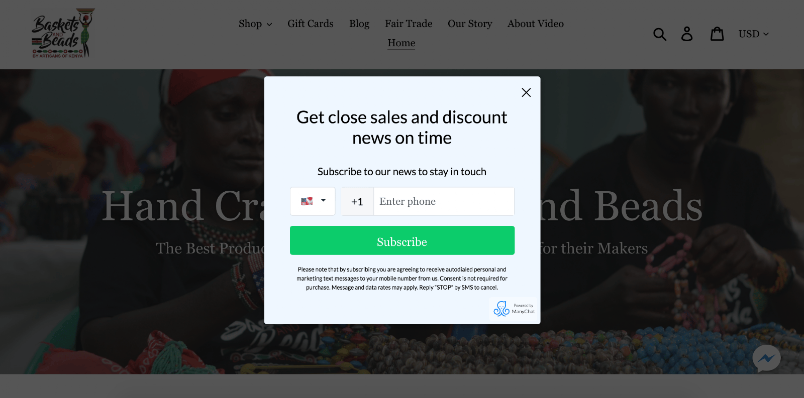
Basket and Beads Kenya
There’s nothing quite like a pop-up to persuade someone to take action. After landing on Baskets and Beads Kenya’s homepage, visitors are greeted with a pop-up CTA with an offer to subscribe to the brand’s SMS list to receive sales and discounts.
The website visitor knows exactly what they’re going to get when they sign up, courtesy of the pop-up’s copy. Plus, the CTA button text is clear, concise, and on-brand.
Ads
General Assembly
General Assembly’s goal for this Instagram story ad campaign was to get beginner coders into a free online workshop. Their first win was using a layout consistent with how we read web content (in an F-shaped pattern).
The word “free,” located in the upper left-hand corner, grabs your attention right away, and the next line explains the ask (the type of workshop). Finally, your eye is drawn down to the CTA text “Sign Up,” enabling you to reserve your spot in minutes.

Thrive Causemetics
Thrive Causemetrics ran an Instagram Story ad to spark interest in a popular beauty product. They ran a catchy video ad with a simple “Shop Now” swipe up button. Customers interested in buying the featured product could purchase it immediately in one swift movement.

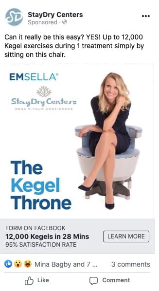
StayDry Centers
StayDry Centers ran a Facebook ad campaign targeting women suffering from loss of bladder control, which converted at 33%, according to Lauren Petrullo, Founder of the Ad Agency Mongoose Media.
StayDry’s ad uses creative copywriting paired with a comical image to encourage people to click the “Learn More” button copy. StayDry’s ad shows that while the CTA text itself is powerful, the offer and story behind your ads is what will ultimately encourage action.
Improving your CTA buttons today
CTA buttons are the first step in your sales funnel. Whether you’re acquiring new contacts, sending abandoned cart messages, or running ads on social media, the call-to-action is a necessary ingredient for getting people to take action.
With these recommendations for call-to-action buttons at your fingertips, you’ll be well on your way to improving conversions across your marketing campaigns, boosting revenue, and reaching your goals as a business owner.
Increase conversions and make more sales with Manychat’s marketing automation tools. It’s free to get started.