According to data from Statista, customers abandoned 88% of all online retail orders placed in March of 2020 before checking out. That’s a 19% increase from 2017 when the global average hovered around 69%.
Shopping cart abandonment affects businesses both large and small. It results in an eye-watering $18 billion in lost sales revenue every year.
Losing sales is bad enough when you’re a startup, but it really hurts you as you grow larger. Let’s say 50,000 visitors come to your site each month, your average order value is $50, and your conversion rate is 1%. You’ll bring in around $300,000 in revenue per year.
If you increase your conversion rate by just .5% each month, you’ll earn an additional $37,500 in monthly revenue, which amounts to $450,000 annually. That’s an extra $450,000 per year, all due to a minor decrease in your cart abandonment numbers.
It’s clear cart abandonment needs to be taken seriously—if you want to generate more sales, that is. And what’s one smart way to go about it? Why, exit-intent popups, of course!
This guide will walk you through the purpose of exit popups (demonstrated using the best examples from around the web) and steps to create your own today.
Why use exit popups?
Exit popups help you grab visitors’ attention before they attempt to leave your site. This popup type tracks mouse movement, so when a visitor’s cursor heads for the exit button, it triggers an overlay popup on the screen. The best exit popups should always include a targeted message with a call-to-action button that encourages the visitor to take action.
Benefits of exit popups include:
- Increased sale conversions. When a user triggers an exit popup, they cannot ignore it. The visitor has to make a choice: to claim or not claim the offer. If your offer is convincing enough, they’ll take advantage of it and complete the checkout process.
- Improved engagement with visitors. User behavior and timing can trigger exit popups. For example, if someone spends more than 30 seconds on your checkout page, you can send an offer through your popup. Or you can show them the popup just before they leave your site. Both tactics encourage people to spend more time on your site.
- Lower bounce rates. You can add exit popups to any page. While they work well on checkout and shopping cart pages, you can also add them to collection pages, your homepage, and product pages to keep shoppers from leaving without buying your stuff.
Exit popups work because they demand action. If your goal is to reduce abandoned carts, try offering a coupon code or promotion to get visitors to complete their purchase.
The 6 best exit-intent popup examples
Need a little inspiration for your cart recovery campaign? Here are six excellent exit-intent popups to get your creative juices flowing.
Alice + Whittles
Alice and Whittles diverged from the traditional exit-intent popup. Instead of employing one that covers the screen when you attempt to leave the shopping cart page, a slide-in widget appears with an offer, and the customer chat window presents a message.
The slide-in menu offers a 10% discount in exchange for your email address. Not a bad deal if you’re considering buying a $200 pair of boots (of which Alice and Whittles sell many). Chances are you’ll take advantage of the opportunity.
The customer chat window is another nice touch. Sometimes shoppers have questions about a brand’s products, and if they don’t have an easy way to get answers, they’re more likely to leave without buying. Alice and Whittles proactively addresses the shopper by sending the message “Let us know if you have any questions 🙂”
Brooklinen

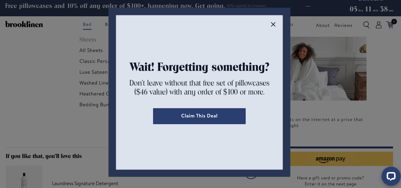
Brooklinen does a great job at capturing your attention on your way out. The popup is simple yet impactful. The “Wait!” and “Forgetting something?” copy instantly catches your eye, making you think twice about leaving. Pair that with the reminder that you’re leaving free stuff behind, and, well, it’s hard to say no to something you may need.
When you add over $100 worth of products to your cart (which is easy to do in their store), you get a free set of pillowcases valued at $46. If you leave during checkout, the popup reminds you of the offer and encourages you to come back with a “Claim This Deal” CTA button.
Partake
If you’re hesitant about using traditional popups, you could borrow Partake’s approach. The brand uses a more discreet exit popup, which materializes as a little bubble near the sale price on their checkout page. The bubble’s CTA is a cool “Get 15% Off,” and when you click it, a traditional popup appears to allow you to redeem the offer.
A shopper needs to enter their email address and phone number to receive the coupon on their mobile device.
Pura Vida

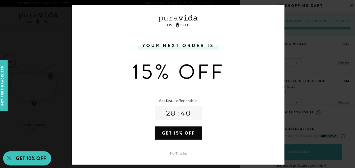
Pura Vida is a popular online destination for bracelets, jewelry, and accessories. The store only uses a sidebar shopping cart that follows you around while you shop in lieu of a separate cart page. Online retailers use this UI because it makes checkout more seamless.
Pura Vida takes a unique approach to shopping cart abandonment through popups. The moment you add $50 worth of items to your cart, the cart total triggers a popup with a 15% off promotion. Here’s the twist: the promotion is only available for the next 30 minutes. Timeboxing the offer adds a sense of urgency, motivating shoppers to buy now. Add in Pura Vida’s free shipping and a free gift with the order, and it’s nearly impossible to leave without purchasing.
Chubbies
Chubbies doesn’t give shoppers a chance to leave before sending an offer. They know customers bounce quickly from the cart page, so after you add a product to your cart, a popup immediately appears. The message is clear and straightforward: shoppers just need to enter their email and receive a 10% off coupon code. This proactive approach implores a customer to make a purchase before they have a chance to consider abandoning the cart.
Like Pura Vida, Chubbies combines multiple offers (free shipping, free gifts, and a promo code) to close the sale.
The Dolan Twins Official Store
When you try to leave a product page on The Dolan Twins Official Store, you’ll see a popup brandishing a 10% off coupon. The popup also highlights the perks of signing up for the brand’s SMS list: early access to product launches, exclusive sales, and other cool stuff.
Once you enter the required information, you’ll have to double opt-in on your phone. Once you’re officially a subscriber, you’ll receive the discount code and can use it right away.
Want to lower abandoned carts and make more sales? Sign up for ManyChat free now.
Create your exit popup
Now that you’ve seen some examples of terrific abandoned cart popups, let’s look at how you can create your own.
Decide on your offer
Most brands promote offers that are only useable for a limited time, which helps motivate people to take advantage of them. Cart abandonment offers potential customers who are on the fence about buying a reason to take the plunge. In general, if customers are close to checkout but are hesitant to buy, the thought of saving a little of their hard-earned cash should tip the scales in your favor.
Offering a discount is a tried-and-true way to win back customers and boost sales. But what kind of discount should you offer? According to Klaviyo’s Abandoned Cart Benchmark Report, the best offers to reduce cart abandonment are:
- Dollar-based discounts. This was the highest performing discount, boasting the second-highest open rate and the highest revenue per recipient ($15.91).
- Free shipping. Shipping costs are the number one reason people abandon their carts. Providing free shipping can be a great way to recover (almost) lost sales.
- Percentage based discount. Although this was the most popular discount used by brands in Klaviyo’s dataset, it had the lowest open rate and revenue per recipient.
Choose one of the above options and give it a shot with your popup. What works well for one audience may not work for another. The only way to know is by testing different discount options.
Build your popup
Once you’ve decided on an offer, it’s time to build your popup.
In ManyChat’s free version, you can choose from various different popups (called Growth Tools) that trigger on exit intent. Go to your dashboard and click Growth Tools, then click + New Growth Tool.
Next, choose one of the overlay widgets you’d like to place on your site.
For this example, we’ll create an SMS modal window to capture shoppers’ phone numbers in exchange for a discount.
When you create a popup in ManyChat, your form will be fully customizable and mobile-friendly. You can add images, copy, colors, and timing. Since we’re creating an exit popup, change the When does it display field to “Exit intent.”
When you’re done, use this guide to install the overlay widget.
Make a plan for new contacts
Your popup will allow you to add new people to your contact list, but it’s important to have a follow-up plan to continue engaging them. ManyChat has several useful tools to help you connect with new contacts. Here are some ideas:
- Create personalized discount codes. If you have a Shopify store that uses ManyChat, you can set up Coupon Campaigns to send unique coupon codes to potential customers. You can add first or last names to the code or any other user input you collect from your popup.
- Launch an onboarding sequence. After someone joins your list, don’t just send them a discount code and forget them. Send a series of messages to promote new products, share your brand story, or just show new contacts that you appreciate them.
- Segment new contacts. Don’t send all new contacts the same content. Use the data you collect from your popup to create customer segments so you can tailor your messages and make them more relevant.
Test, test, and test some more
The best way to lower your cart abandonment rate is by testing. Try multiple signup forms or different copy and images. Even test the follow-up messages you send to new contacts. In ManyChat, you can pit personalized coupons against static coupons to see which one works better. You can also experiment with different Growth Tool widgets.
Either way, your end goal is to weed out the underperforming tactics and double down on what works.
Using exit-intent technology to increase conversions
Most people who land on your website will leave a cart behind. It’s unavoidable. One thing you can avoid, though, is idly standing by as they go. With an exit popup, you can recover potentially lost sales and drive more revenue for your business.
Start today by creating one in ManyChat for free! You’ll start to see an impact on your business in no time.


