Your Instagram grid is a landing page of its own. And right now, you might have a reel here, a random quote there, and a brand collab sandwiched between two selfies. That’s okay, but having a cohesive Instagram grid theme can turn that visual chaos into something that actually makes people hit the “follow” button.
If that’s a goal of yours, great — ahead, we’ll break down 8 grid themes that are popular today and how to pick the right one for your account.
TL;DR
- An Instagram grid theme is a visual style that ties your profile together.
- We’ve outlined 8 popular grid themes to choose from, including color-based, checkerboard, text-forward, puzzle, filters, and more.
- Pick a theme that speaks to your identity as a creator or brand, then use a feed planner to preview posts before publishing.
Your Grid is a Landing Page
An Instagram grid theme is the visual aesthetic you keep in mind when posting new content. Having a theme helps you communicate to anyone who lands on your page what your content is typically about (through vibes, but also fonts, colors, and recurring subjects).
Having a cohesive grid is pleasing to the eye, but more importantly, it helps you grow and monetize (a consistent brand presentation can increase revenue by as much as 33%). With a signature style of content, scrollers will recognize your content in their crowded feeds — no small feat in 2026.
8 Instagram Grid Themes to Inspire Your Next Set of Posts

If you have a current theme — say, a sleek website with a black-and-white interface — use that as a starting point for your Instagram grid theme.
Why? Because it will help people recognize you across all your channels, and the last thing you want is for someone who loves your Instagram to head to your website and be confused about whether it’s yours.
That said, you can always rebrand, and if you’re looking for grid-spiration for your Instagram profile, we’ve got it. Let’s explore 8 different grid theme examples.
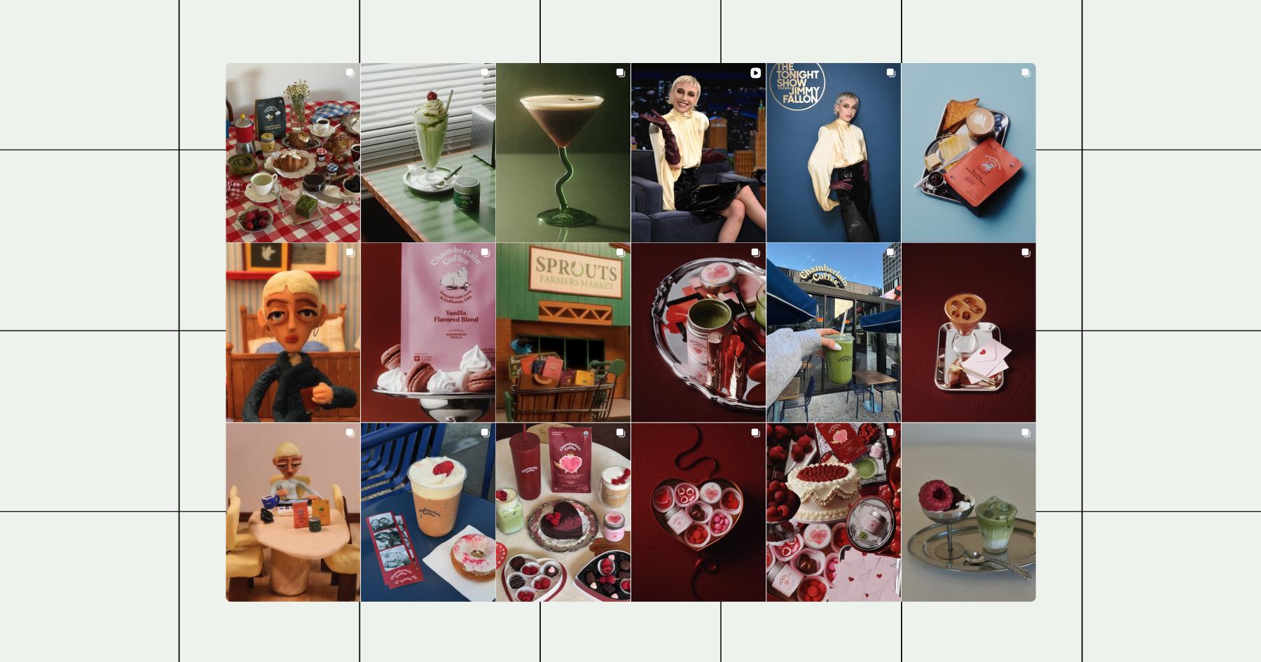
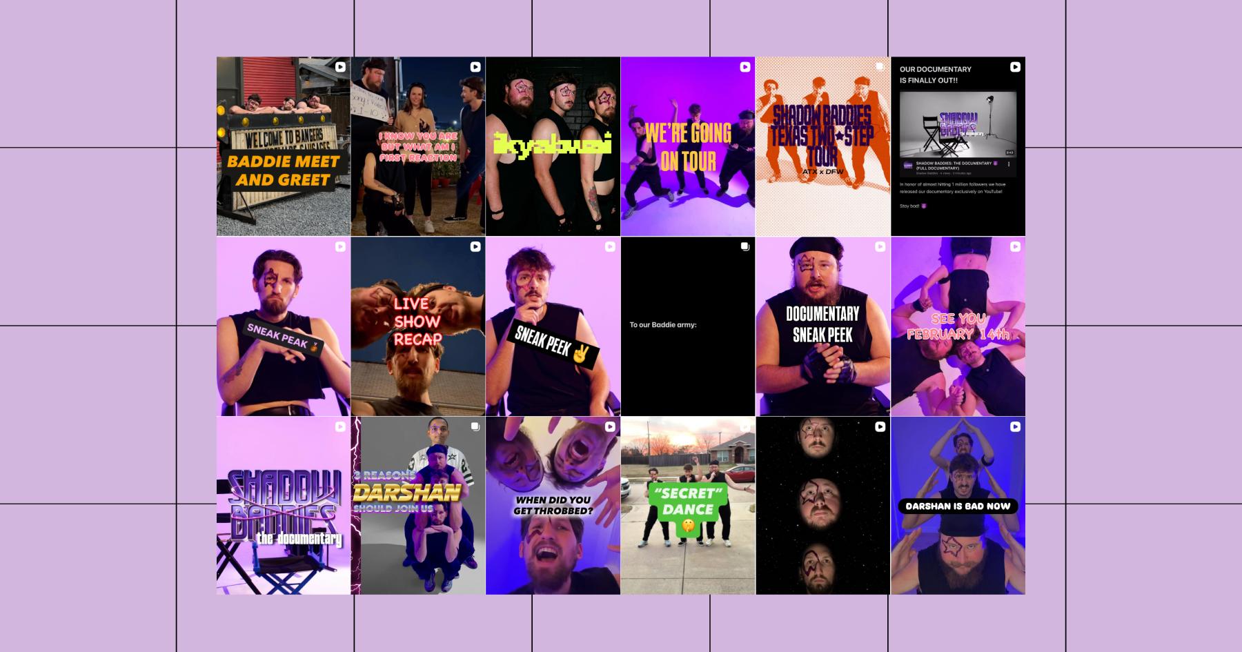
1. Color theme
A color-themed Instagram grid is a popular option amongst both brands and creators because it’s simple to implement. The most popular color themes on Instagram are black and white, neutrals, and pastels, but if you want to go with a neon purple color like The Shadow Baddies (@shadowbaddiesofficial), that works too.
2. Filter-based
Similar to a color theme, you can also run your photos through an Instagram filter or presets (if you use a third-party photo or video editing tool) before uploading them to your grid.
This theme type gives you some flexibility because you’re not limited to one color; just use the same couple of filters on the photos and reels you post to achieve a cohesive aesthetic on your Instagram grid.
3. Checkerboard
The checkerboard Instagram grid is exactly what it sounds like. You create it by posting in an alternating pattern. So if one of your posts is black, the following would be white, like in this example from The Female Hustlers’ Instagram profile.
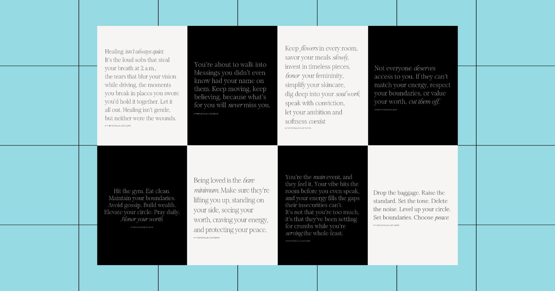
Coaches, educators, and motivational brands who mix quotes with photos love a checkerboard theme because it helps avoid a monotonous look. And you’re not limited to black and white; you can use other colors, patterns, or even alternate between photos and text.
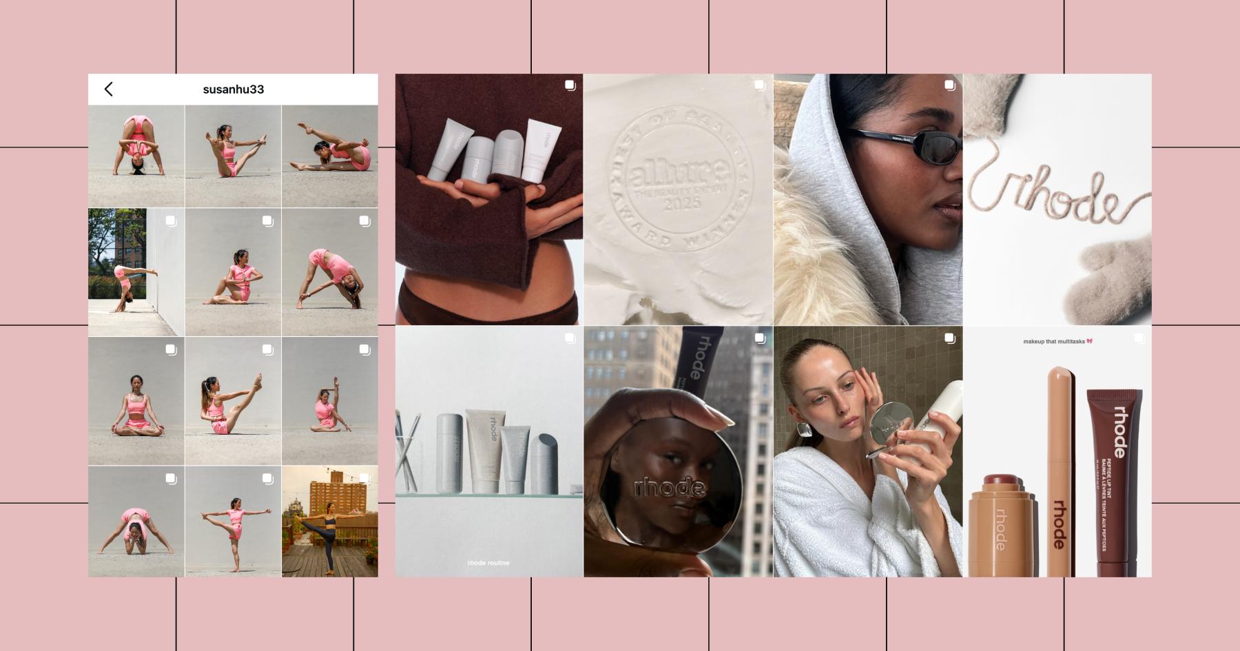
4. Minimalist
The minimalist Instagram theme is all about subtlety, both in color and in the photos themselves. If you’re a creator with a minimal or “clean girl” aesthetic, or a brand with a simple color palette and logo, this theme will work well for you.
Typically, the minimalist aesthetic is associated with neutral colors (white, beige, etc.) and negative space. You can use text on your grid, but keep it simple. Below are examples from yoga influencer Susan Hu and skincare brand Rhode.
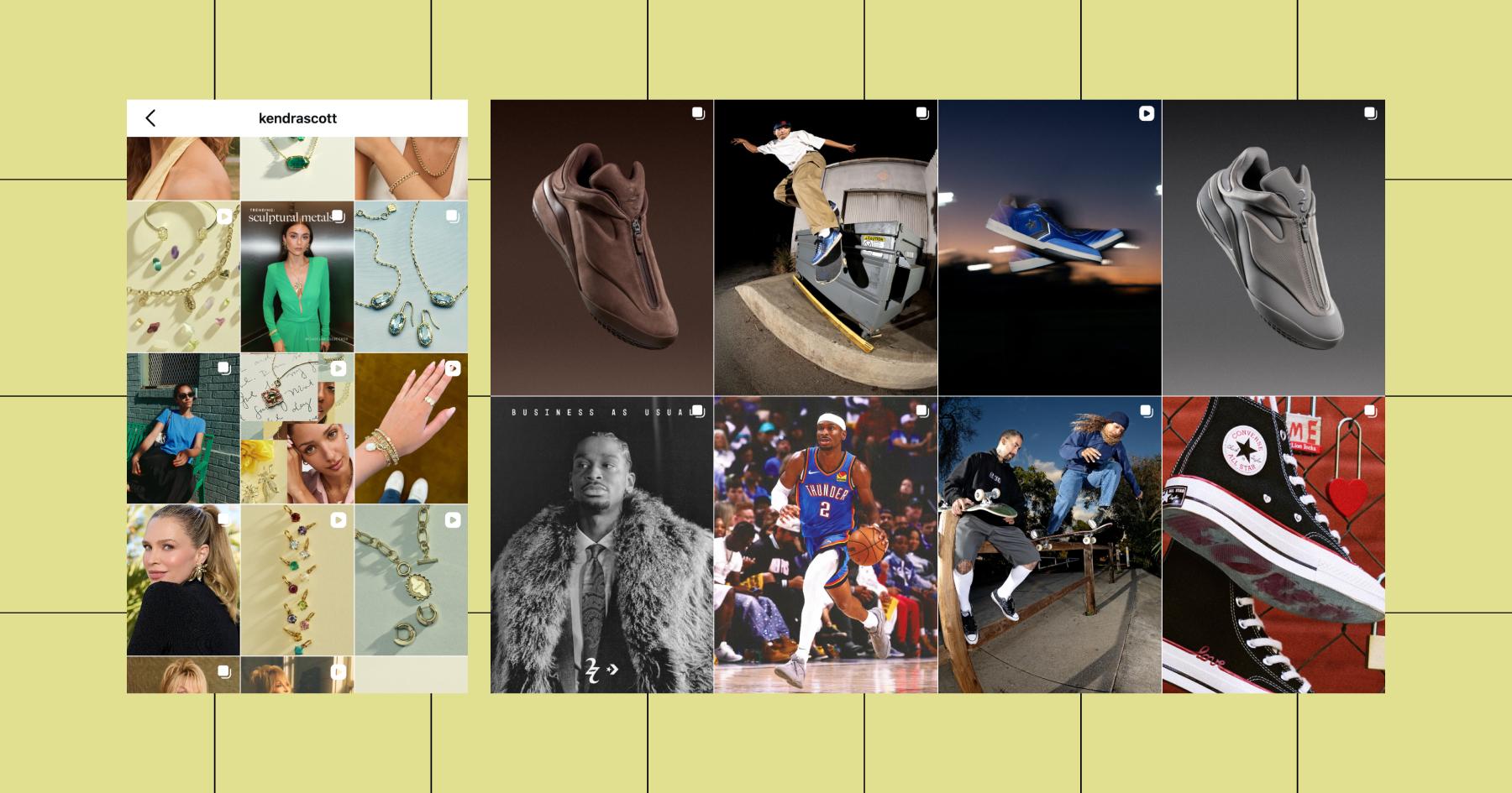
5. Flat lay
The flat-lay theme prominently features products. It’s a popular photography style for e-commerce brands and retail businesses.
With this theme, your grid should have plenty of flat lays, but don’t use them for every post. And even with your flat lays, you should mix it up — show the products on different backgrounds or use editing to jazz up your product shots (like Kendra Scott and Converse do in the examples below).
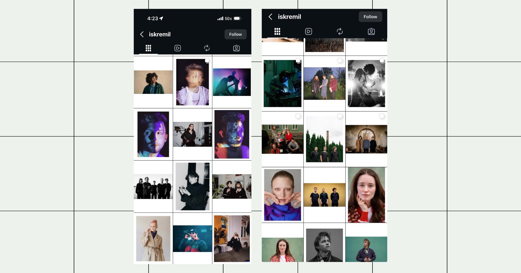
6. Borders
If you don’t want to limit yourself to a particular theme but still want a cohesive look, you can add a white or black border to each post. Bold borders were all the rage back in 2014, and believe it or not, people are still using them (and pulling it off).
For example, photographer Emil Vestre (@iskremil) adds a white border to all of his photographs to help scrollers consume each post as its own piece of art.
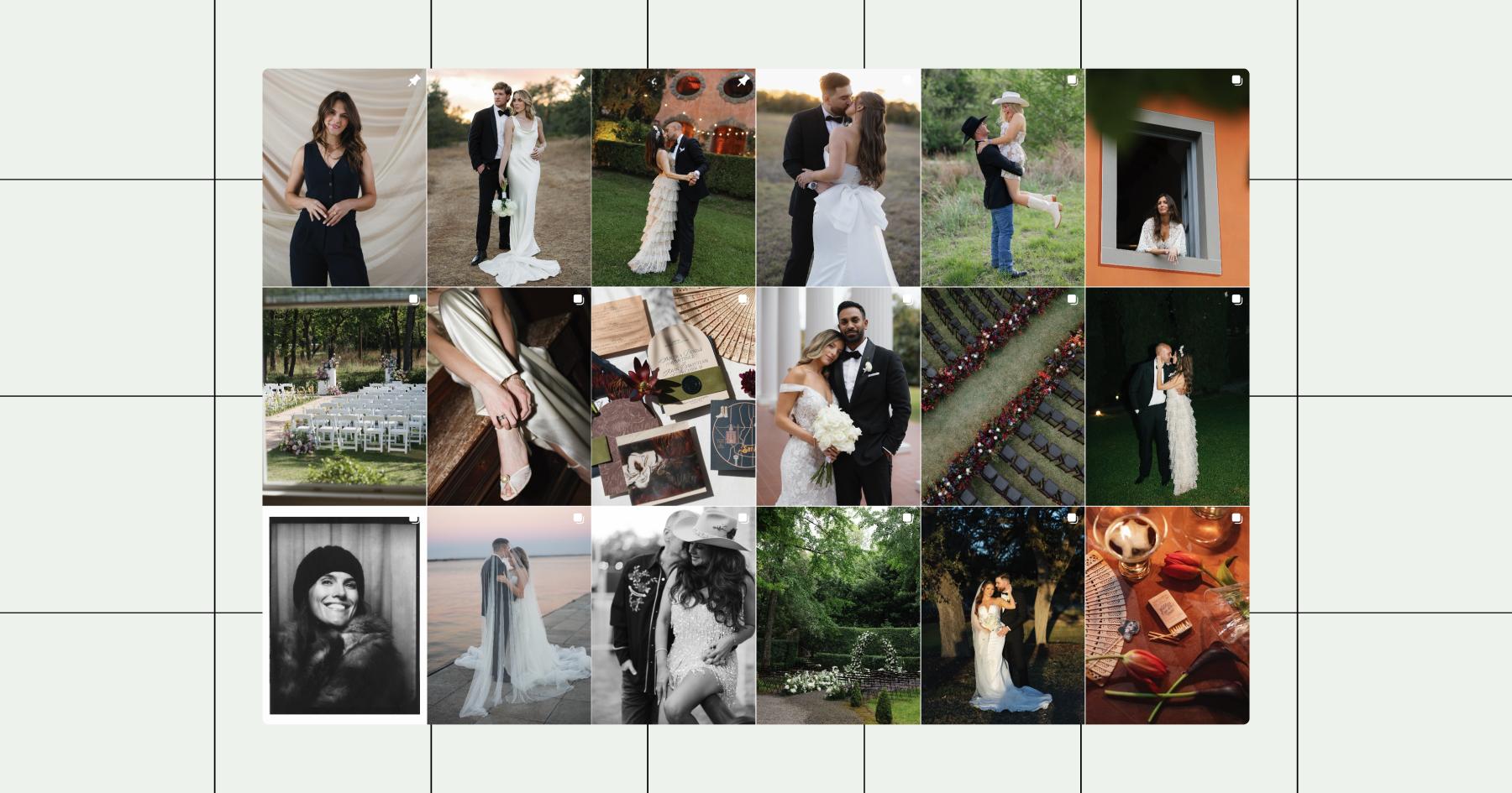
7. Puzzle grid
If there’s one Instagram theme that looks incredible when pulled off, it’s the puzzle grid. With this theme, each post is combined into a single large image. The only problem is that it can look confusing when just one of the posts appears in the feed if you don’t consider that while designing them.
Today, there are a lot of apps and templates out there to help you create a puzzle grid. You don’t need advanced editing skills to figure it out. Tools like My Social Boutique, Design Hub, and CarouselMaker can all help you achieve the puzzle look without in-depth editing.
8. Text-forward
With this theme, the majority of the photos posted to your account contain some type of text, whether that’s a quote, poem, story, or otherwise. Writers like Lily Diamond, whose grid is featured below, often have a text-forward Instagram grid naturally.
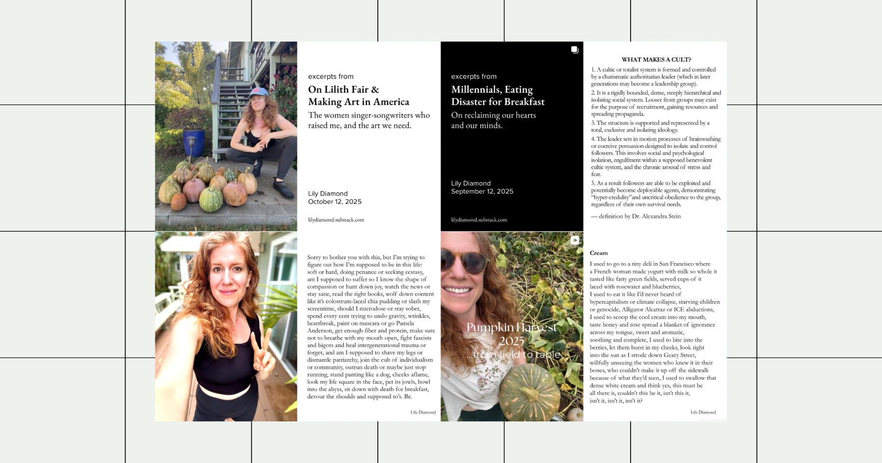
Read more: Shine Bright Like a (Lily) Diamond
People who share knowledge (coaches, teachers, entrepreneurs, founders, etc.) may also use this theme.
Theme | Best for |
|---|---|
Color theme | Brands with a strong signature color |
Filter-based | Lifestyle creators, travel, fashion |
Checkerboard | Coaches, educators, motivational brands |
Minimalist | Skincare, architecture, modern brands |
Flat lay | E-commerce, product-based businesses |
Borders | Photographers, artists |
Puzzle grid | Designers, campaign launches |
Text-forward | Coaches, educators, thought leaders |
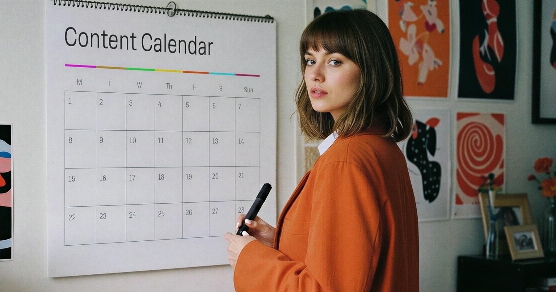
Building (and Actually Sticking to) Your Grid

Picking a theme is the fun part. Sticking to it three weeks later when you’re scrambling to create Instagram content? That’s where most people fall off.
Your brand guidelines are the starting line
The Rule of 7 suggests customers need five to seven interactions with a brand to build recognition and trust. Your Instagram account is the perfect place to meet that threshold because you’re sharing new content regularly.
However, you need to lay some groundwork to make sure you stick to your theme. To do that, create some guidelines to reference when posting new content to Instagram.
Make sure to include:
- Your color scheme and brand fonts
- Any presets or filters you use
- Caption style and tone of voice
- Typical backgrounds/sets for content
Don’t just post it — preview it first
Here’s the thing about Instagram grid themes: a post might look great on its own, but not so much when it’s next to another post. Before you publish anything, preview how it’ll look in context.
Instagram feed planners let you drag and drop upcoming posts into a mock grid layout to spot problems before they go live. Pair them with a tool that lets you schedule your posts in advance to keep your themed grid on track. This is especially critical for puzzle and checkerboard themes where placement is everything.
Here’s a breakdown of the best options for the job:
- Canva: Has Instagram grid templates built in, so you can design posts that match your theme without starting from scratch every time.
- VSCO: The go-to for filter-based themes. Save your favorite preset and apply it to every photo for instant consistency.
- PLANOLY: Drag and drop upcoming posts into a visual grid planner so you can see exactly how they’ll look before publishing.
- Plann by Linktree: Similar grid preview features, plus color palette analysis to help you stay on-theme.
- Later: Offers a visual content calendar with grid preview — handy for teams managing multiple accounts.
Your Grid Isn’t The Only Thing That Needs a Glow Up

When your new theme starts catching scrollers’ attention, you’re going to want to capitalize on that. Respond to the DMs, reply to the comments, and most importantly, thank all of those new followers for stopping by. That’s how you grow, and if you don’t want to go at it alone…
Frequently asked questions
An Instagram grid theme is a consistent visual style applied to all posts on your profile, making your grid look cohesive when viewed as a whole. It could be a color palette, a filter, a layout pattern, or a content style — anything that ties your posts together visually.
You don’t need to change your grid theme on a set schedule. Most creators and brands evolve their aesthetic gradually rather than overhauling it overnight. If your current theme still reflects your brand, keep it. If it feels stale, start introducing small shifts and see how they land.
Grid themes don’t directly affect how the Instagram algorithm ranks your posts in feeds. But a cohesive aesthetic can increase your follow-through rate when people visit your profile.
The color theme or filter-based theme is the easiest to start with. Pick a consistent color palette or one of the best Instagram filters to apply to every post, and you don’t have to worry about post order or complex layouts.
Yes. Reels and carousels appear in your main grid, so choosing a consistent cover image or thumbnail style keeps your theme intact even with mixed content formats. Most grid planning tools let you preview how reel and carousel covers will look alongside your regular posts.